B’S COQUITO · VISUAL IDENTITY · NOVEMBER 2026A little taste
of home.
A warmer, clearer identity for Bianca’s seasonal coquito: rooted in Puerto Rico, shared with family, and made for Tampa’s holiday tables.
View the storefront Download the brand kit
THE IDEAFamily at the heart.
Island warmth in every detail.
We retained the existing cream-and-cocoa palette, graceful serif lettering, and tropical cues. The approved palm symbol simplifies the original artwork into a clean olive silhouette. The wordmark is set as B’S COQUITO, retaining an uppercase possessive S. Olive green adds a quieter holiday note; cinnamon adds warmth.
Positioning: Small-batch coquito, inspired by a sister’s recipe and shared with the Tampa community.
Brand promise: A little taste of home. Voice: Personal, welcoming, proud of its roots. Write as Bianca would speak to a neighbor. Keep it warm and specific; avoid invented heritage claims, health claims, or unverified ingredients.
THE LOGO FAMILYOne mark. Room to grow.
Download the horizontal wordmark · Download the favicon · Download the repeating pattern
Leave generous clear space around each logo. Use the primary lockup at 180px or wider; use the emblem for small avatars (minimum 32px). Keep proportions intact. Use cocoa on cream or cream on cocoa/olive. Avoid shadows, outlines, stretching, or busy photography behind the mark.
The approved symbol is a transparent raster asset embedded in the SVG layouts. The wordmark uses Arial with an uppercase possessive S. These SVG files are layout containers, not fully traced vector masters. The website uses DM Serif Display for editorial headlines and DM Sans for functional text.
COLOR SYSTEMWarm, grounded, familiar.
Coconut cream
#F7F2E9
Cocoa
#38291F
Palm olive
#777047
Warm sand
#DED1BA
Cinnamon
#A55D3C
Use cream as the primary canvas, cocoa for text, olive for seasonal fields and calls to action, sand for gentle structure, and cinnamon sparingly. Flavor accents identify the collection; keep body text in cocoa.
TYPE & LANGUAGEElegant headlines.
Easy-to-read everything else.
A little taste of home.
DM Serif Display , headlines, with selective italics.
DM Sans , navigation, labels, pricing, and ordering.
Georgia , portable logo lettering and fallback serif.
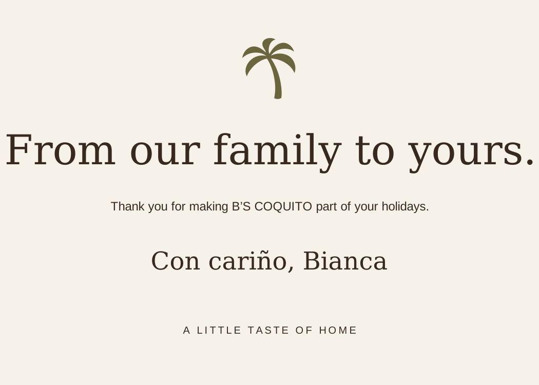
Headline examples: Five flavors. One family tradition. / From our family to yours. / Bring a little home to the holidays.
Short bio: B’S COQUITO began with a call to Bianca’s sister, her best friend and the person behind the family recipe. Rooted in their Puerto Rican heritage, each seasonal batch brings a little taste of home to friends, family, and neighbors in Tampa.
PACKAGING SYSTEMA bottle for every table.
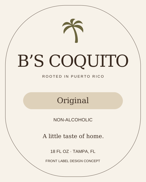
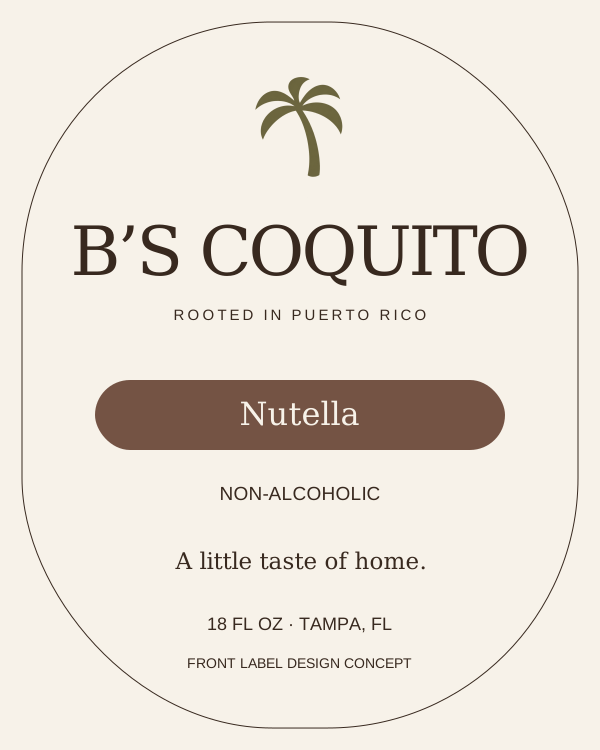
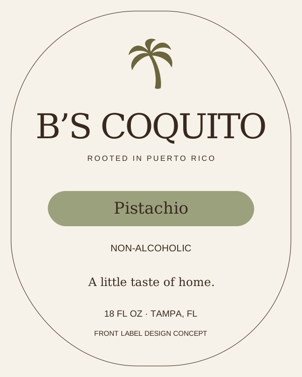
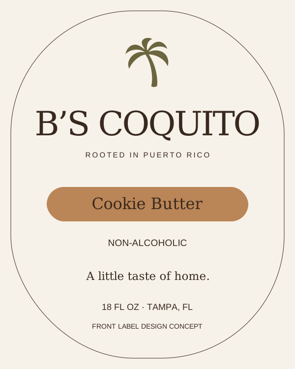
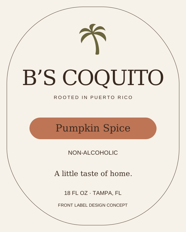
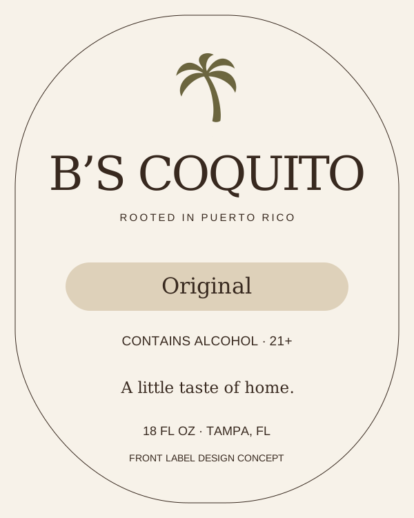
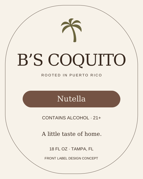
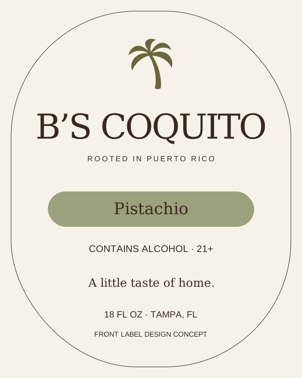
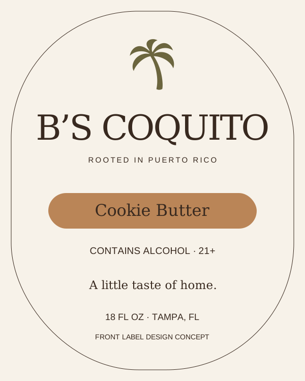
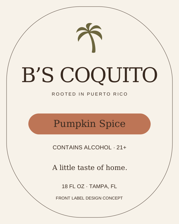
Ten editable front-label concepts: five flavors, each with a clearly identified alcohol or non-alcoholic version.
Design concepts, not finished retail labels. Confirm bottle label dimensions, ingredients, allergens, storage directions, maker details, alcohol content where applicable, and required labeling before printing. The bottle artwork is an illustration of the proposed packaging.
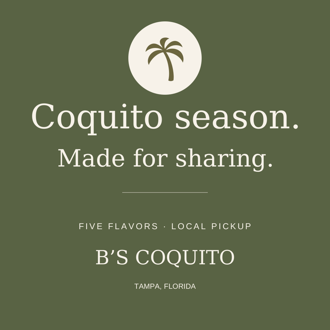
SHARE THE SEASONA little consistency, everywhere.
Suggested caption: Coquito season is here. Five flavors, a treasured family recipe, and a little Puerto Rican holiday warmth, made right here in Tampa. Choose your bottles and reserve your local pickup at least two days ahead. Con cariño, Bianca.
Photography direction: Creamy coquito, natural light, warm surfaces, a little greenery, and the feeling of gathering at home. Use original product photography where possible. Keep props simple and give the product room to breathe.